The Art of Food Presentation: Tips for Plating Like a Pro
Selecting the appropriate plate for your meal may seem like a simple decision, but it can greatly enhance the overall dining experience. Consider the size of the dish you are serving – a small plate may make a large portion look overwhelming, whereas a large plate can make a small portion appear inadequate. Furthermore, the shape of the plate can also play a role in how the food is presented and enjoyed by diners.
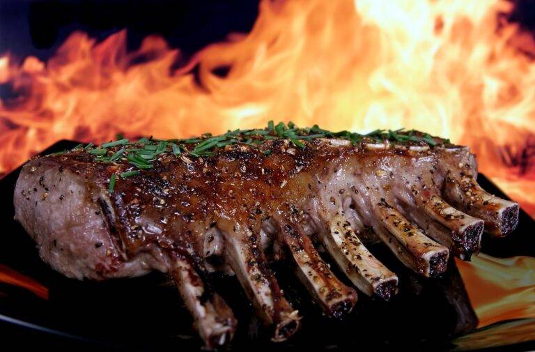
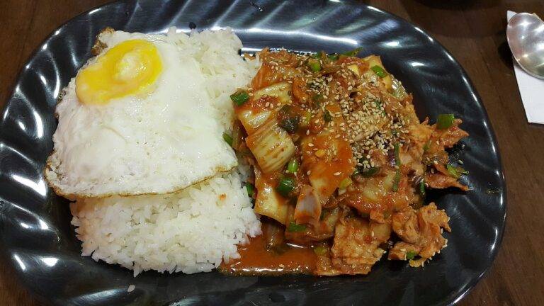
In addition to size and shape, the color of the plate can significantly impact how the food is perceived. Opting for a plate that contrasts with the colors of the dish can make the food pop and look more appetizing. For example, serving a vibrant salad on a white plate can make the greens and vegetables stand out, creating a visually appealing presentation that is sure to impress guests.
Utilizing Color Contrast
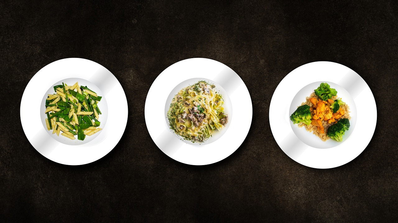
When it comes to creating visually appealing dishes, utilizing color contrast can make a significant impact. By strategically pairing vibrant and contrasting colors on the plate, you can elevate the overall presentation and entice the senses of the diners. Think about incorporating a variety of hues, such as pairing bright greens with deep purples or vibrant oranges with rich blues, to create a visually striking composition.
In addition to considering the color wheel and contrasting hues, don’t forget about the importance of textures and shapes in enhancing color contrast. By combining different textures, such as creamy and crunchy elements, alongside contrasting colors, you can create a dynamic and visually captivating dish. Experiment with different plating techniques, such as layering ingredients or arranging them in a mosaic-like pattern, to further enhance the contrast and make your dish truly stand out.
How can color contrast be utilized when choosing the right plate?
When choosing the right plate, consider using colors that are opposite each other on the color wheel to create a high contrast look. For example, pairing a white plate with a dark blue napkin can create a visually striking effect.
Why is color contrast important in design?
Color contrast is important in design because it helps to create visual interest and makes elements stand out. It can also aid in readability and accessibility for those with visual impairments.
Are there any rules to follow when utilizing color contrast?
While there are no strict rules, it’s generally a good idea to choose colors that have a significant difference in lightness or darkness to create a strong contrast. Experiment with different color combinations to find what works best for your design.
How can I use color contrast to make my plate presentation more appealing?
You can use color contrast to make your plate presentation more appealing by incorporating a variety of colors that complement each other. For example, using a bright green garnish on a red plate can create a visually stunning presentation.